The Shopworks
All-in-One B2B Workforce SaaS Platform for Streamlined Business Operations
Details
Shopworks pioneers AI-driven workforce solutions for retail, optimizing operations and customer experiences in the SaaS B2B sector. Their innovative software and services streamline workforce planning, scheduling, and task management, revolutionizing retail operations. The goal is to enhance usability by aligning designs with the MUI design principles and ensuring consistency across the entire platform.
In my two years with the product, I’ve significantly enhanced usability by leveraging user feedback. I’ve led projects on management tables, forms, and dashboards, also spearheading the design system and optimizing schedules and big data functionalities.
Client
The Shopworks
Tasks
Research / User Experience / User Interface / User Testing / Prototyping / Design System
Timeline
4 months
Helping admins generate secure passwords automatically
In the fast-paced world of retail workforce management, efficiency and security are paramount. At Shopworks, we faced a significant bottleneck: manual password generation. When associates failed to create a password after three attempts, managers had to intervene, generating and activating secure passwords manually. This process was not only time-consuming but also prone to errors, impacting both operational efficiency and security.

Problem
Every time an associate failed to create a password after three attempts, a manager had to manually generate and activate a secure password. This process was not only time-consuming but also prone to human error, creating potential security vulnerabilities and delaying the onboarding process.
Solution
Implement an automated system to generate and activate secure passwords after three failed attempts by an associate. Additionally, streamline the process for managers to manually unblock users. This solution aimed to improve efficiency, reduce errors, and enhance user satisfaction.
Uncovering Insights Through Collaboration
Workshops and Interviews
I delved into understanding the pain points through collaborative workshops and interviews. It became evident that the manual password process frustrated both managers and IT administrators. Managers spent valuable time on repetitive tasks, while IT was concerned about potential security risks associated with human-generated passwords.
Key Insights:
- User Roles and Goals: Identified primary user roles—associates, managers, and IT administrators—and their specific needs.
- Pain Points: Manual password generation was a significant bottleneck, causing delays and increasing the risk of errors.
- Stakeholder Concerns: Managers worried about the time and effort required, while IT administrators were concerned about security risks

Collaborative Approach:
By addressing concerns head-on—highlighting the security risks of the current system and the efficiency gains of automation—we secured support for the automated solution.
Stakeholder Management:
Securing buy-in for the proposed changes was crucial. Stakeholder alignment was achieved through workshops and individual consultations, ensuring all perspectives were heard and valued.

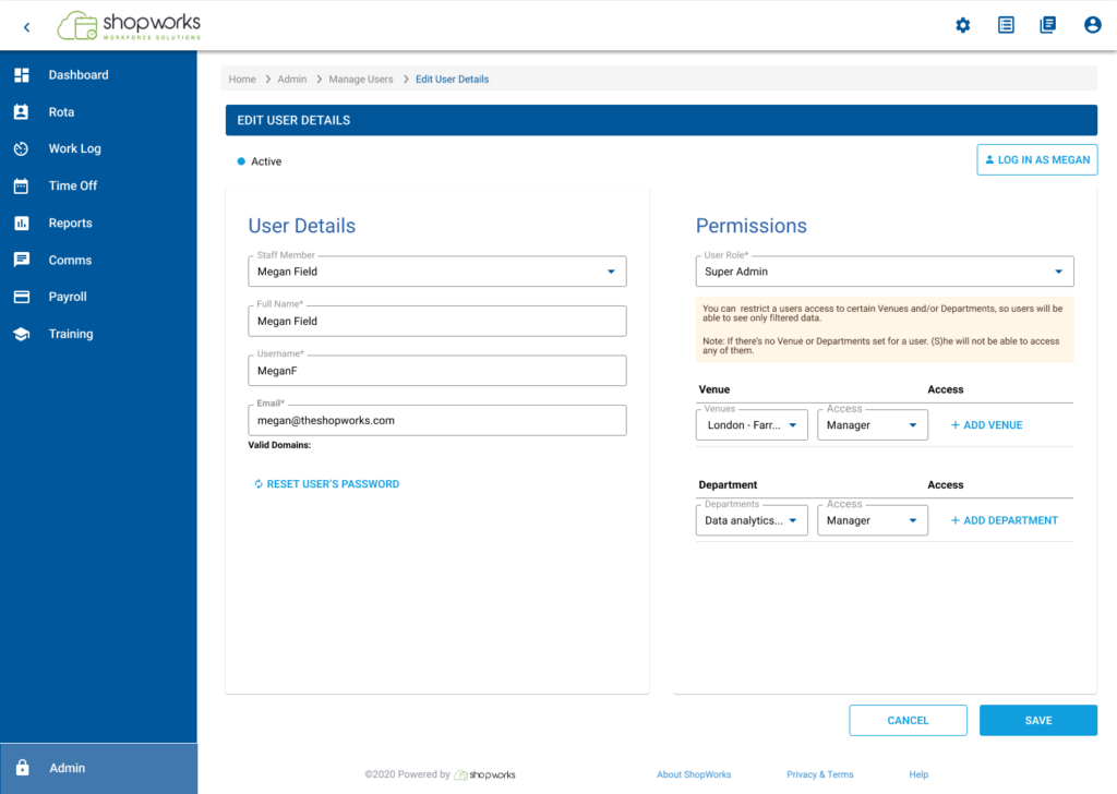
Analysis of the current Design Issues

Strenghts
Clear Labeling and Instructions
- Each input field is clearly labeled (e.g., "Full Name," "User name," "E-mail").
- The role selection section includes a helpful note explaining the implications of setting venues and departments.
Logical Layout
- Information is grouped logically: personal details at the top, roles and access permissions in the middle, and password settings at the bottom.
- The form follows a logical top-to-bottom flow, making it easy to follow.
Role and Permissions Management
- The dropdown for selecting the role and the associated venues and departments is user-friendly.
- The interface allows adding multiple venues and departments with role-specific settings, showing a clear indication of user access control.
Areas for Improvement
Visual Hierarchy and Spacing
- The overall design could benefit from more whitespace between sections to improve readability and reduce visual clutter.
- The "Edit User Details" header could be more prominent to reinforce the user's current task.
Consistency in Button Design
- The "Log in as Nick Hill Manager" button stands out due to its different style but might be confused with the "Save" function due to its prominence. Ensuring consistent button styling could reduce potential confusion.
Accessibility Considerations
- The color contrast between text and background should be checked to ensure it meets accessibility standards for readability.
- Including labels with icons (if any are added) and ensuring form elements are navigable via keyboard are essential for accessibility.
Defining the solution
Insights
Automated Password Generation Button
- Objective: Create a button for managers to generate secure passwords automatically.
Functionality: Enables quick and secure password generation for users.
Impact: Streamlines password creation, reducing manual workload and ensuring security.
Introducing User Status Indicators
- Objective: Initially, aimed to differentiate between active and suspended accounts.
- Shift in Priority: Now prioritising identification of locked accounts for better user accessibility.
- Enhanced Functionality: Status indicators now provide immediate insight into user accessibility.
- Outcome: Improved visualization aids in better management of user accounts.
Improved Table Interactivity
- Objective: Enhance user interaction with tables and improve the visibility and accessibility of table actions.
- Proposed Solution: Implement a design where table actions (e.g., edit, delete) are visible only on hover.
- Next Steps: Conduct usability testing to validate if this approach improves user experience compared to the current design.
- Expected Outcome: If successful, the new approach will enhance user experience by providing a more intuitive interaction method with tables, potentially increasing efficiency and user satisfaction.
Streamlined User Form Design
- Objective: Simplify data entry and align fields with user needs and Material-UI (MUI) design principles.
- Approach: Redesigned the form content to streamline user input, maintain design consistency, and improve information hierarchy.
- Key Focus Areas:
- Streamline user input
- Maintain design consistency
- Improve information hierarchy
- Outcome: Enhances usability and improves user experience by facilitating easier data input and clearer organization.
Crafting the Solution
Ideation and Sketching
Armed with insights, I embarked on a mission: automate the password generation process.
The solution was clear—to implement a system that would automatically generate and activate secure passwords after three unsuccessful attempts. But it wasn’t just about automation; it was about streamlining the entire user management experience. This meant empowering managers with tools to quickly unblock users, ensuring a seamless onboarding journey.
Designing for Impact
With stakeholder alignment secured through compelling workshops and consultations, I delved into prototyping. Low-fidelity wireframes evolved into high-fidelity prototypes, meticulously crafted to align with Material-UI design principles and user expectations. Each iteration was subjected to rigorous A/B testing and usability studies, refining the design based on real user feedback.


Testing and validation
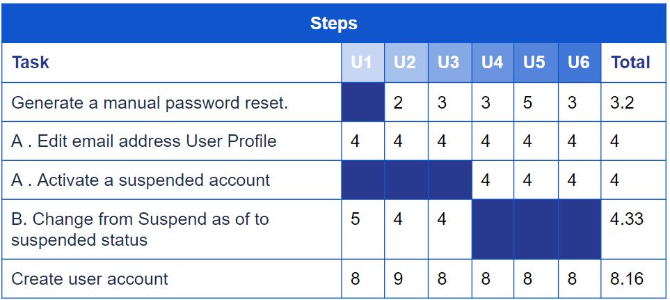
A/B Testing
To validate our decisions, we conducted A/B user testing on various locations of the reset password button, providing clarity on the best path forward and determining the optimal placement to enhance discoverability.
Usability testing
Real user feedback validated the intuitiveness of the automated system, highlighting a reduction in manual intervention and administrative workload.

Results
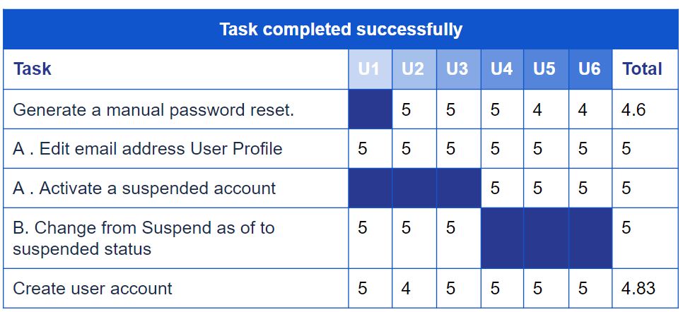
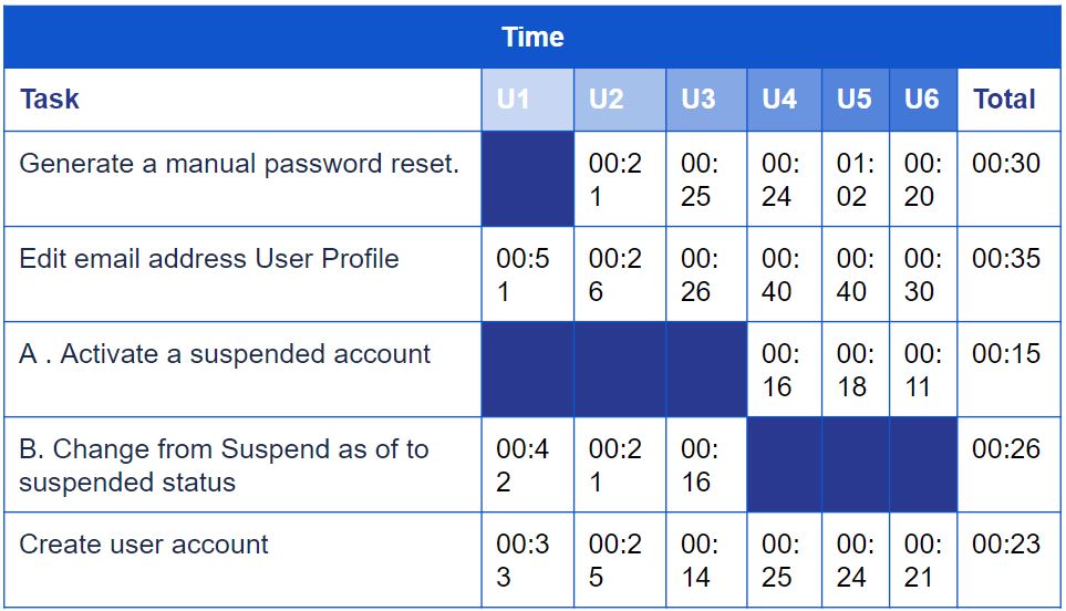
Optimised Reset Password Button Placement:
Testing Results:
- Initial testing found placing the reset password button above the login field ineffective.
- Relocating it below the user´s name increased discoverability, especially for locked accounts, leading to higher success rates for password resets.
- Next Steps:
- Implement the new placement: to roll out the button placement change for all users.
- Refine the design further: adjust the button’s size, color, and label for better visibility based on user feedback.
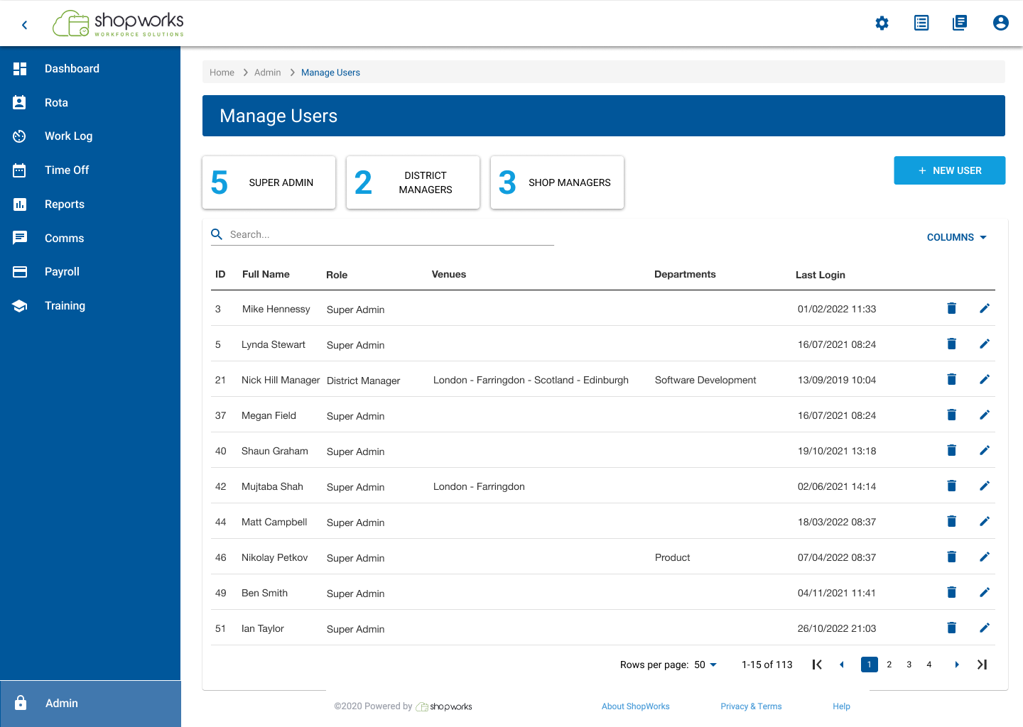
Prioritised User Status Display:
- Results: Testing with the prioritised user status display (focusing on locked accounts) have confirmed a reduction in time for administrators to identify these users. This would streamline account management processes.
- Next Steps:
- Implement the new status display: they likely make this the default view for user statuses.
- Refine the status display: adjust the display format based on user feedback.
- Next Steps:
Improved Table Interactivity:
- Testing Results: Usability testing likely revealed that making table actions visible only on hover did not improve user experience compared to the current design. Users found it confusing or missed the actions entirely when they weren’t constantly visible.
- Next Steps: Since the hover interaction wasn’t implemented, the team decided to stick with the current design for this functionality. If the existing design was functional and users were familiar with it, keeping it might have been the best course of action.
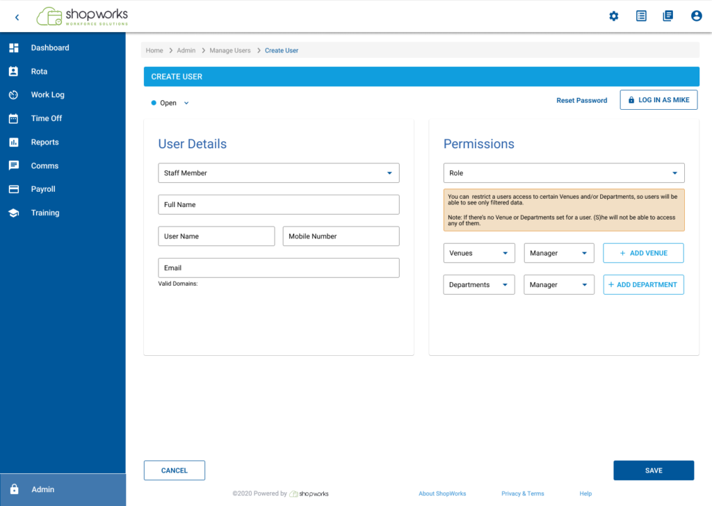
Streamlined User Form Design:
- Testing Results: Usability testing showed that the redesigned user form with simplified data entry was more suitable for the user. This suggests the new design was easier to use, led to fewer errors, and potentially improved user satisfaction.
- Next Steps: Given the positive testing results, the team decided to:
- Implement the new form design: This make the streamlined form available for all users to experience the benefits of simpler data entry.





Learnings: The Journey of Iteration and Discovery
Discoverability Matters:
Intuitive design placement enhances user experience, as seen in improved button placement for password resets.
Efficiency through User-Centric Iteration
Iterative improvements based on user feedback enhance interface efficiency and satisfaction.
Users prefer persistent visibility:
Our users have a distinct preference for features that remain consistently visible rather than appearing only on hover. This insight underscores the importance of maintaining elements that ensure continuous accessibility, aligning with user expectations and enhancing overall usability.
Value of Simplicity:
Simplified data entry not only reduced errors but also potentially improved user satisfaction. This emphasises the value of prioritising simplicity in design choices.
Final journey

Evolving Visual and Functional Improvements

Before
- Cluttered interface with minimal whitespace.
- Inconsistent button styling leading to user confusion.
- Manual password management process prone to errors.

After
- Clean interface with effective use of whitespace.
- Consistent and intuitive button styling.
- Automated password generation reducing errors and administrative workload.
Key visual changes
Visual Hierarchy and Spacing:
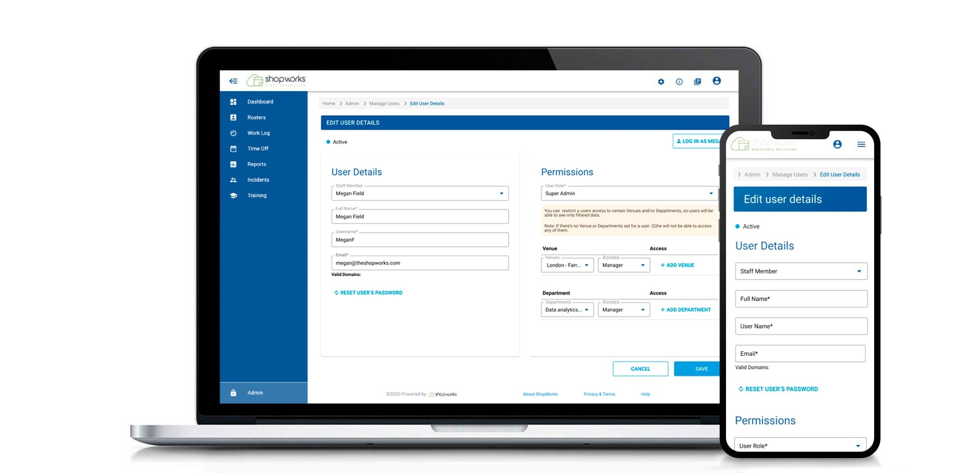
- As mentioned before, the new design uses whitespace more effectively, resulting in a cleaner interface.
- Sections like “User Details” and “Permissions” are now clearly separated, improving information accessibility for users.
Consistency and Clarity:
- The new design maximizes whitespace for a cleaner interface.
- “User Details” and “Permissions” sections are now distinctly separated, enhancing user information accessibility.
Role and Permissions Management:
- The “Permissions” section is streamlined with dropdown menus for “User Role,” “Venue,” and “Department” access levels.
- Clear “+ ADD VENUE” and “+ ADD DEPARTMENT” buttons facilitate easy addition of permissions.
Improved Readability:
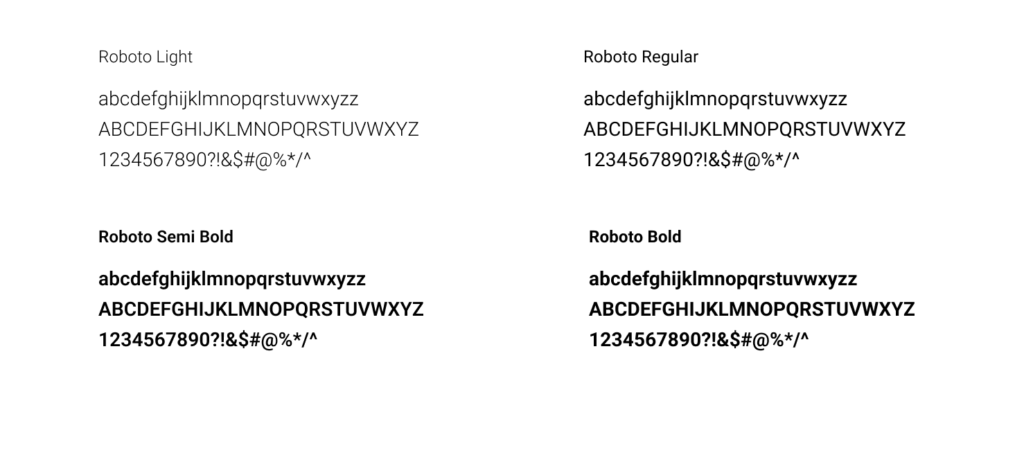
- Font size and weight are now consistent, boosting readability.
- Blue headers and labels visually differentiate sections and fields.
Mobile Responsiveness and Accessibility:
- Simplified layout and spacing indicate improved mobile adaptability.
- The blue color scheme enhances contrast for better accessibility.
Enhancing Security with Multi-Factor Authentication

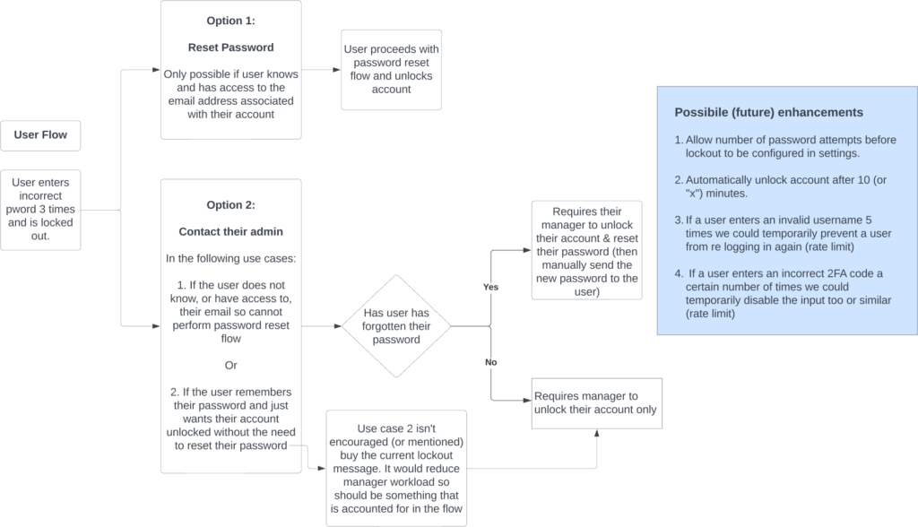
User flow

Success and Outcomes
Dashboard
Before
After
Problem
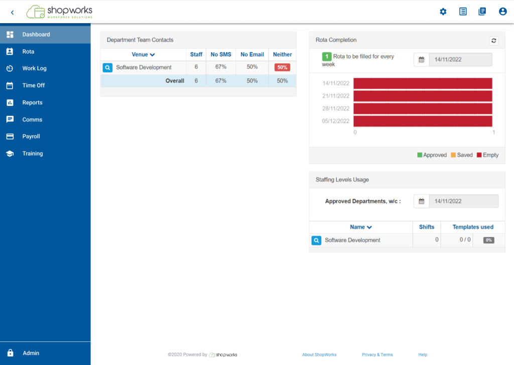
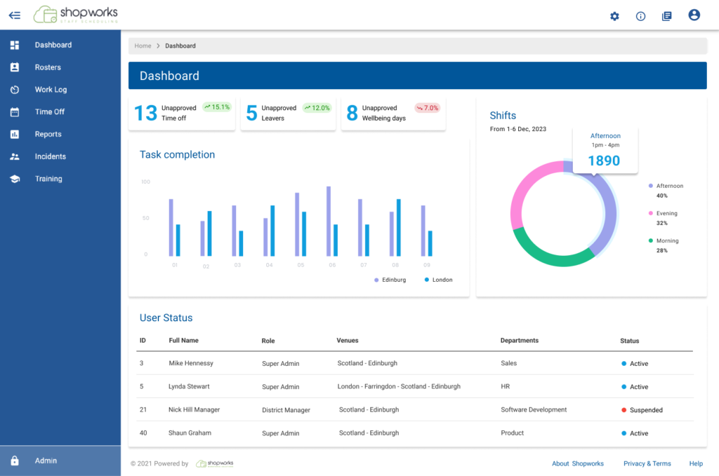
The old Dashboard design lacks relevance and personalisation, leading to user disengagement. It fails to provide customised information based on user roles and lacks sufficient data compared to competitors’ products, with limited customisation options proving a significant drawback.
Solution
Revitalize the old Dashboard design by allowing users to customize it based on their roles, integrating key metrics like outstanding missed scans and missing rotas, offering robust personalization options, conducting competitor analysis for feature integration, and iteratively refining based on user feedback to enhance engagement and utility.
Design Impact: Creation of a Design System
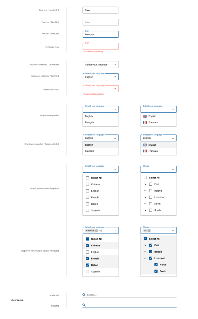
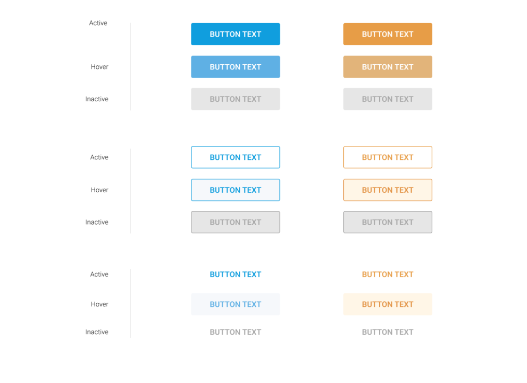
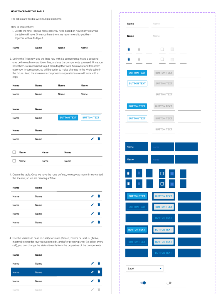
When I joined the company, there were only basic guidelines to ensure some level of consistency. I saw the need for a more robust solution and took the initiative to develop and implement an Atomic Design System. Key achievements include:
- Modular Components: Reduced development time by 50%.
- Alignment with Frontend: Increased frontend efficiency by 60%.
- Time Savings: Cut design iteration time by 70%.
- Consistency: Decreased design discrepancies by 65%.
- Collaboration Boost: Improved project delivery timelines by 55%.
Colors

Fonts
Inputs
Buttons
Tables
Key Improvements
- Standardised various platform design elements according to Material-UI (MUI) principles, ensuring consistency and coherence, thereby enhancing usability and user experience.
- Enhanced the password recovery process to be more user-friendly and intuitive, prioritising simplicity and efficiency to facilitate smoother account access and engagement.
- Implemented a status dropdown feature for activating or suspending employers, providing users with enhanced control and efficiency in managing employee statuses.
- Created a comprehensive design system from scratch, significantly improving consistency and efficiency throughout the product’s interface, resulting in a more cohesive and user-friendly experience.
- Introduced a two-factor authentication (2FA) system, bolstering platform security and providing users with an additional layer of protection for their accounts.
- Organised data, tables, and dashboards for clarity, improving user understanding and navigation within the platform.


