Empowering Businesses to Offer On-Demand Pay with No Interest
Details
fastPAYE is a On Demand pay application that allows businesses to pay staff before payday. fastPAYE is not providing a loan, so there is no interest. Earned salary is drawn down early for a small transaction fee, but free for those on minimum wage.
The primary aim was to integrate functionality enabling multiple selections for actions related to Invitations, Actions, and Withdrawals.
Client
Fast PAYE
Tasks
Research / User Experience / User Interface / User Testing / Prototyping
Problem
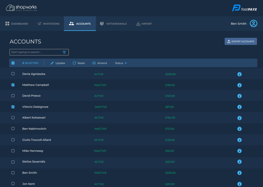
Users are struggling with navigation on the accounts page due to an overwhelming number of buttons and unclear instructions, leading to confusion and frustration. The design lacks intuitive navigation and consistency across platforms, resulting in a poor user experience.
Solution
Simplify the interface by consolidating buttons, improving alignment, and providing clearer guidance to enhance usability and accessibility.
Uncovering Insights Through Collaboration
Understanding the process
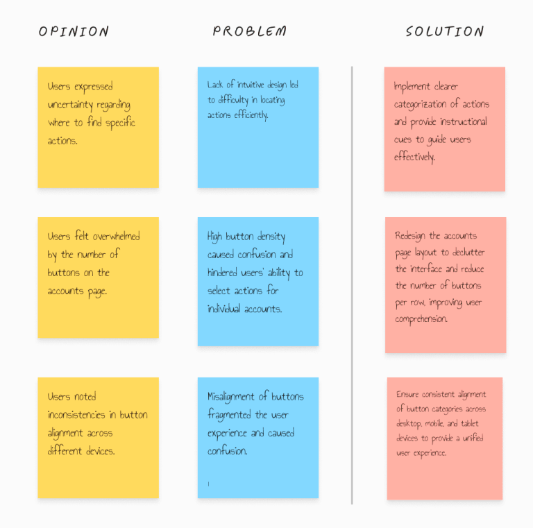
Based on our research and user testing, we uncovered several challenges with the current design, including users struggling to locate actions and feeling overwhelmed by the abundance of buttons on the accounts page, leading to confusion and information overload.
Additionally, users encountered navigation difficulties due to the lack of intuitiveness in the interface. In response to these issues, our plan was to unify button categories, ensure consistent alignment across different platforms, and provide clearer instructions for actions.
Our goal was to enhance the user experience by simplifying navigation, reducing cognitive load, and improving overall usability.
Through this process, we learned that simplifying design elements and providing clear instructions significantly improve user navigation and reduce confusion, while aligning buttons consistently across platforms enhances accessibility and usability for all users
Crafting the solution
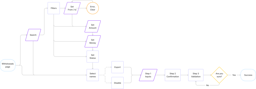
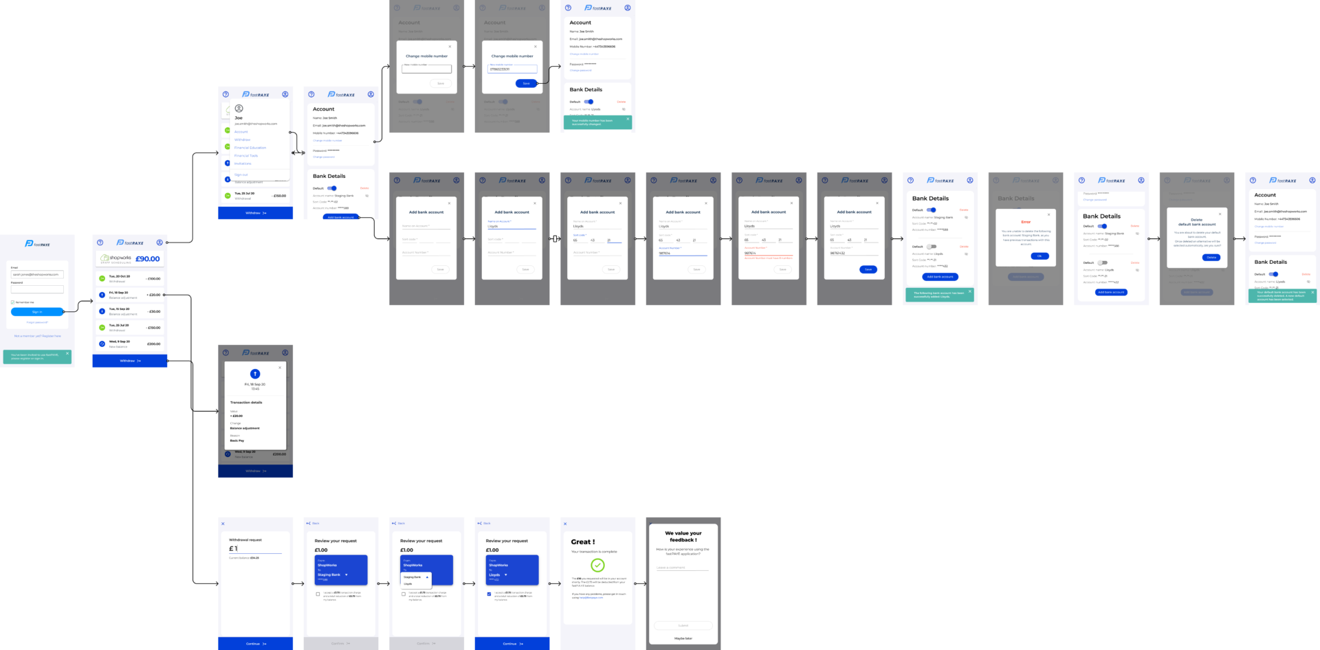
User flows
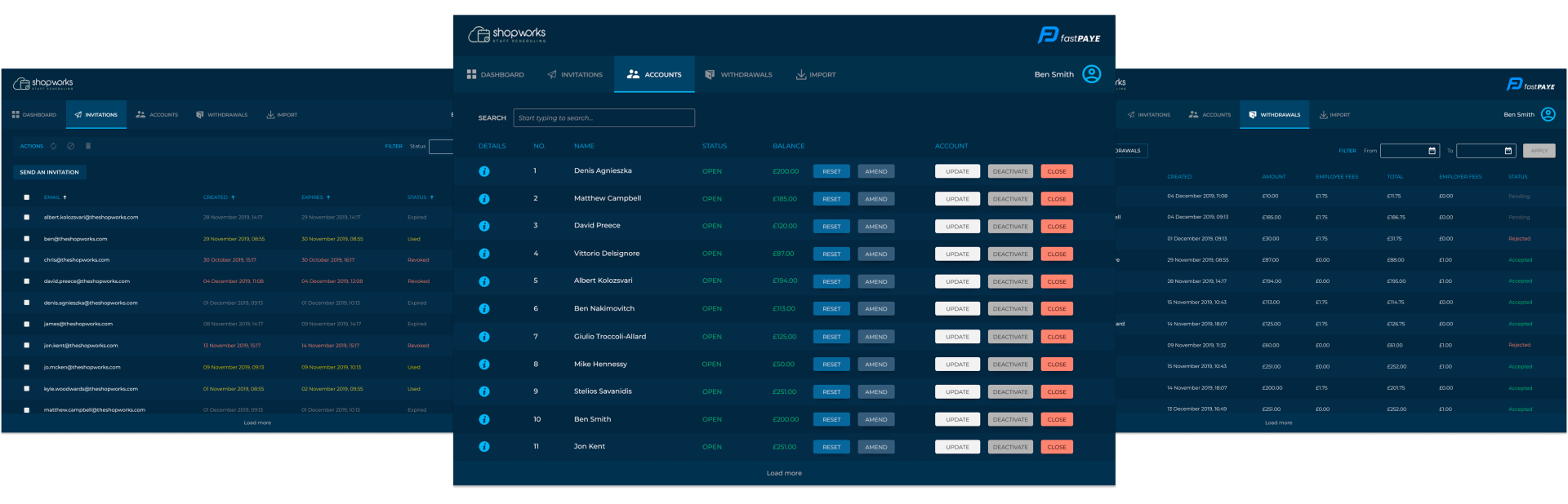
Account
Withdrawals
Invitations
Testing and validation
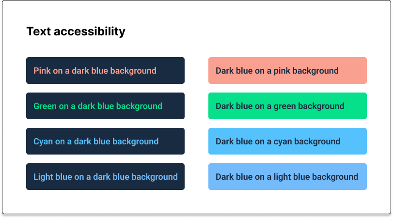
Screen filters and actions: A/B Testing findings
A
B
Before
After
Multiple selection
Once the pain points were addressed, we proceeded with implementing the multiple selection functionality, which was already optimized in the previous design.
To conclude the flow, we revamped the three-step process, making it easier to visualize the data and providing users with insights into the success or failure of their actions before confirmation, based on user characteristics.
Success and Outcomes
Increase in Revenue
0%
Decrease error
0%
User confidence
0%
Improvem. Task Completion
0%
Payer app (0 - 1)
User Flow
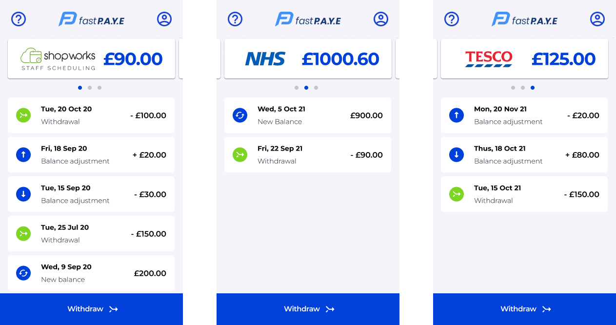
Multiple Accounts
Key improvements
Adding concise explanations for actions to streamline user interaction.
Removing unnecessary buttons to simplify the screen and enhance clarity.
Optimizing the table layout for improved readability and ease of use. Increasing the prominence of the headline for clearer page identification.
Based on our research, we conducted user testing to uncover issues with the current design.
Our findings revealed challenges such as users struggling to locate actions and feeling overwhelmed by the abundance of buttons on the accounts page, leading to confusion and information overload.
Additionally, users encountered navigation difficulties due to the lack of intuitiveness in the interface. To address these issues, we plan to unify button categories, align them across different platforms, and provide clearer instructions for actions.