My Killik
Streamlining Wealth Management for Seamless Withdrawals
Details
The myKillik app, part of Killik & Co’s digital platform, allows clients to manage their investments and financial data 24/7. We were tasked with designing a streamlined withdrawal process within this app, focusing on ease of use and clarity in messaging. The challenge was to create a user journey that enabled clients to withdraw funds in just 1-2 screens, ensuring transparency and simplicity at every stage.
I was tasked with redesigning the withdrawal process for the myKillik app. The goal was to create an intuitive, user-friendly experience that streamlined withdrawals while providing transparency about the process, specifically withdrawal timelines, available wealth, and fund transfers.
Client
Killik & Co.
Tasks
Research / User Experience / User Interface / User Testing / Prototyping
Problem
The existing withdrawal process was causing user confusion and creating unnecessary friction, primarily due to the unclear messaging on fund sources and timelines, alongside a cluttered user interface.
Solution
To create a simplified, user-friendly flow that guides users step by step through the withdrawal process while providing clear, transparent information on fund availability and transfer times.
1. Discover
Understanding the process
Objective: The withdrawal process was perceived as complex by users, causing confusion about where the funds were coming from and how long the process would take.
Research Methods:
- User Interviews: Conducted interviews with existing app users to understand their pain points. Key insights showed that users struggled with the unclear explanation of fund sources (cash or investment sales) and found the existing interface overwhelming.
- Competitor Analysis: I analyzed competing fintech apps to identify best practices in withdrawal flows. This helped highlight the need for a simplified, step-by-step process.
Findings:
Users wanted a clear overview of their total wealth and an indication of where the withdrawal funds would come from (cash first, then investment sales).
The existing design lacked clarity on timelines for cash withdrawals vs. investment sales, leading to support calls.

2. Define - Framing the problem
Insights
We learned that users required:
- Clear and actionable feedback when something went wrong.
- Transparent timelines on success screens so they understood when to expect their funds.
- Error recovery pathways that didn’t leave them feeling stuck or frustrated.
Problem Statement
The current flow resulted in user frustration due to unclear withdrawal timelines and inadequate error handling. The new design needed to facilitate a more intuitive experience, providing detailed states for success, errors, and delays.
3. Develop – Exploring Solutions
Design Flow:

Flow Improvement:
- Designed a simplified withdrawal confirmation screen with clear account details, making it easier for users to verify information.
- Created failure states that provided actionable next steps, enhancing the user experience during error scenarios (e.g., “Something went wrong” and “Your request is taking longer than expected”).
- Added error recovery paths that guide users back to the home page or to retry the transaction, ensuring minimal user frustration.
Collaborative Approach:
- Worked with product managers to ensure that the error messaging matched the app’s tone and addressed common user concerns.
- Partnered with engineers to understand what real-time data could be surfaced in the app, ensuring that users received accurate withdrawal timelines.
Design & Iteration:
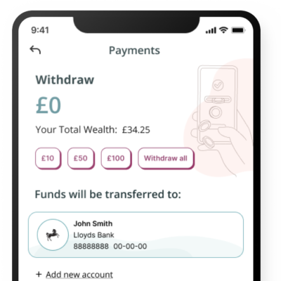
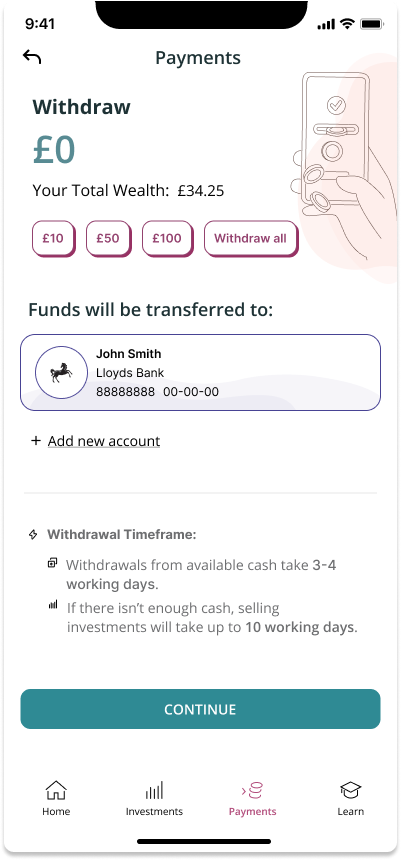
Two versions (A and B) were created for testing user preferences:
Both versions were designed in Figma using auto-layout and components for scalability. I also created libraries for text styles and colours, ensuring consistency throughout the design. The triadic colour palette was applied for both accessibility and brand alignment.
Version A:
- Simple, linear layout for a clear, distraction-free user journey.
- Ideal for users who want a straightforward, seamless process.
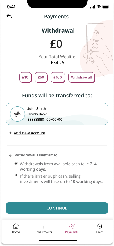
Version B:
- Visually dynamic with separated content and actions.
- Allows for future enhancements like illustrations or animations, appealing to users who prefer a more engaging interface.
Version A
Version B
Wireframes & Prototyping:
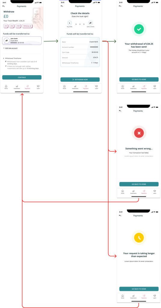
I developed mid-fidelity wireframes that evolved into interactive prototypes. These were tested with internal teams to validate the flow improvements. I focused on:
- Streamlining the confirmation step to reduce friction in the decision-making process.
- Ensuring consistency in error and success states to avoid user confusion.
The prototype included success and error flows:
- Success flow: A simple confirmation with clear instructions on when the money would arrive.
- Error flow: Detailed states showing what went wrong and how users can resolve it.
A/B testing
I conducted an A/B test with users to gauge their preferences between the two versions.
Key Metrics:
- Clarity of information.
- User confidence in completing the transaction.
- Ease of recovering from errors.
Results:
- Version B was preferred by users due to its more detailed and personalised feedback. They appreciated knowing when to expect their funds and how to resolve issues that arose.
- 70% of participants indicated they felt more in control of the process with Version B, particularly during error states.
This data influenced the final design decision, opting for Version B to enhance user satisfaction.
A


B


4. Deliver: Final Implementation & Results
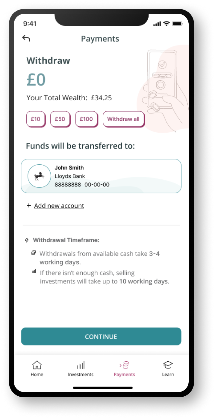
Final Design & Handoff:
The selected design, Version B, provided a more transparent and user-friendly withdrawal process. The final design featured:
- A clear success screen that included estimated times for funds to arrive.
- Detailed error states with actionable next steps, reducing user frustration.
- Seamless integration of the design system, with reusable components and a colour palette that remained true to the brand.
Success and Outcomes
Design System

Key improvements
Simplified User Journey
Designed the entire withdrawal process to be completed in just 1-2 screens, making it efficient and easy for users to follow with clear, step-by-step guidance.Enhanced Messaging Transparency
Clear and prominent messaging about the withdrawal sources, detailing the timeframes for withdrawing from the cash fund (3-4 days) and selling investments (up to 10 days), minimising user confusion.Figma-Based Design System
Developed a scalable design system in Figma using components and auto-layout. This ensures flexibility across different devices, making future updates and design iterations easier to implement.
Clarity in Action Points
Introduced clear visual cues for key elements like total wealth, bank account details, and the “Withdraw All” option, ensuring users can make informed decisions quickly.Interactive Enhancements
Added subtle animations and illustrations to make the user experience more engaging and guide users naturally through the withdrawal process.

